Improved navigation and scalability across ezManage, a system that allows restaurants to manage their catering operations
ezManage is ezCater’s all-in-one SaaS dashboard used by restaurant and catering partners to manage orders, operations, analytics, and business growth tasks. Our restaurant partners were struggling not because the platform lacked features, but because they couldn’t find or act on what mattered most.
SaaS dashboard
Usability testing
Product design
B2B
Product strategy
Information architecture
UX research
Year
2021
Role
Product design leadership
Product strategy
Research synthesis
Cross-functional facilitation


ezManage had an unclear organization and no notifications, creating chaos for restaurant partners.
Restaurant partners were overwhelmed by scattered actions, buried settings, and unclear pathways that made completing critical tasks, like accepting orders or finding insights, inefficient and error-prone. This resulted in frustrating experiences, increased support tickets, and potentially lost orders. Partners didn’t know where to find the information they needed when they needed it.
The deeper problem wasn’t a lack of features, but a misalignment between how the product structured information and how users actually operated their businesses.
I defined clear design goals to guide decision-making and shape product direction and priorities
Understand jobs
Expose tasks and info based on real use patterns, not internal product silos.
Discovery of growth tools
Help partners discover features that drive business growth instead of hiding them deep in menus.
Surface actions
Make incoming orders and key operations observable and actionable from any context.


Opportunity 1
Introduce buckets of information based on frequency and jobs.
Opportunity 1
Unclear labeling (“My office”) resulted in low adoption and usage.
Opportunity 1
Unclear labeling (“My office”) resulted in low adoption and usage.
Opportunity 2
Maintain the ezCater brand across all experiences.
Opportunity 2
Dashboard was used most to check order and delivery status.
Opportunity 2
Dashboard was used most to check order and delivery status.
Opportunity 3
Consolidate all navigation into a single left-hand menu using tabs.
Opportunity 4
Favorites lacked accurate data, causing unhappy orderers.
Opportunity 4
Favorites lacked accurate data, causing unhappy orderers.
Our restaurant partners operate differently than we originally assumed.
I partnered with UX research to run job-mapping workshops with restaurant partners. We observed that partners grouped tasks by operational needs, such as daily work, business insights, and store settings, rather than the way the current UI groups them. This insight gave us a new mental model to build from: navigation must mirror the partner's actual workflows.
I refined restaurant partner jobs into operational buckets.


Reconstructed navigation around operational jobs to make completing tasks more customer-driven.
The original navigation reflected product categories that often didn’t align with how partners thought about their work. I restructured the information architecture into major operational buckets like Daily Operations, Insights, and Settings, aligning with how partners naturally approach their tasks. This dramatically reduced cognitive load and improved findability.


Incoming orders are now always visible and immediately actionable.
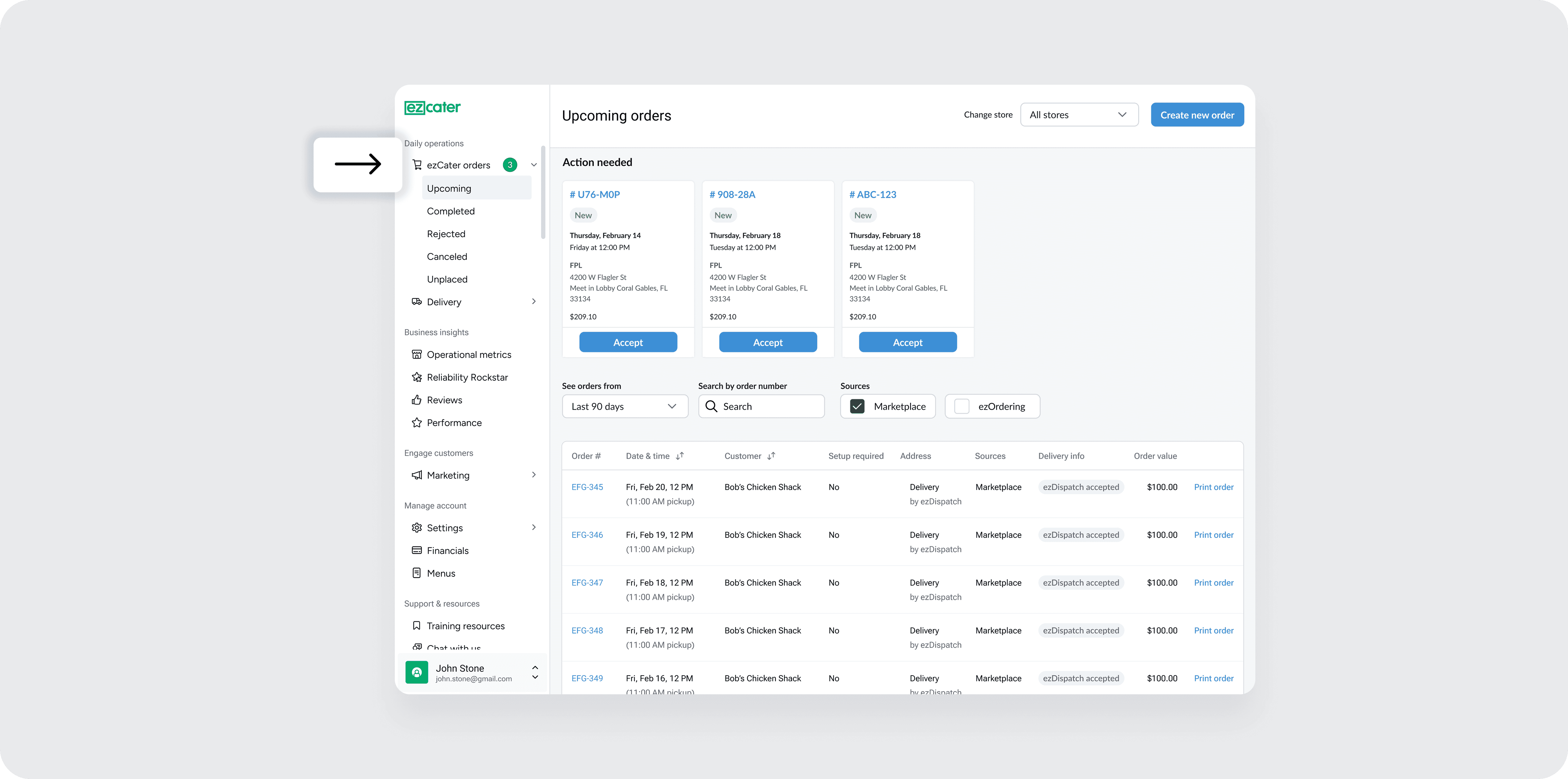
I introduced persistent order counts and real-time notifications directly in the sidebar navigation. Partners could now see and accept orders without hunting for the right view, eliminating friction at critical moments. This decision turned a passive dashboard into an action-ready interface.


I introduced a "Grow business" tab to drive traffic and growth to other ezCater products.
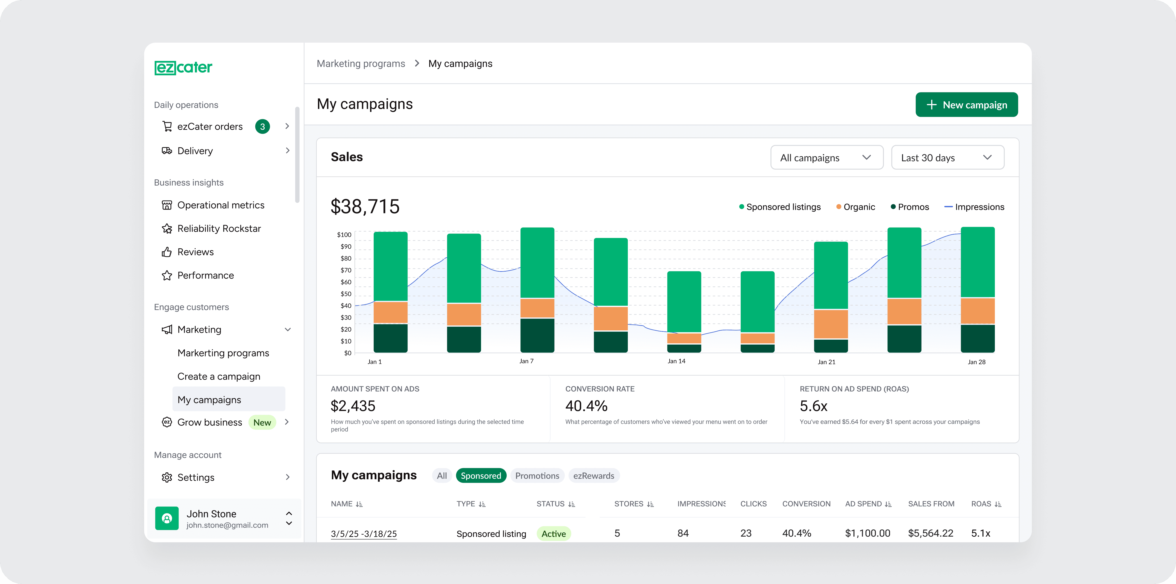
Usability tests showed that partners frequently missed features such as marketing tools, Relish, and group ordering. To support ongoing adoption, I added clear headers such as “Grow Business” and “See What’s New” to the navigation, making business-growth capabilities visible in the everyday experience.


Validating design system components through real product work.
I worked closely with engineering to translate design intent into implementation, producing interaction specs that documented component logic, state behavior, and layout responsiveness. This collaboration also served as a proof point for adopting components from the evolving Ingredients design system, validating component flexibility and consistency before broader rollout.
Wins and outcomes
These metrics show clear improvements in clarity, discoverability, and speed of action; key indicators of successful navigation design in complex SaaS contexts. Through usability testing, we achieved a 95% task-completion rate, with an easy score of 100% across the 7 tasks. After release, we saw a 32% reduction in task time in areas that required immediate action, such as accepting orders and assigning delivery drivers.
Navigation as a strategic product lever
This project reaffirmed that information architecture and navigation are core product levers in complex systems, not superficial UI elements. Changing navigation influenced task efficiency, feature adoption, and partner confidence across the platform, underscoring how strong IA design is foundational to product success.
The ezManage navigation redesign exemplifies the balance among user cognition, product strategy, measurable outcomes, and scalable architecture. I led the vision and execution, influenced cross-functional alignment, and delivered a navigation system that dramatically improved usability across a business-critical SaaS experience.

